PALERMO COLLECTION
View the full range of these 70’s inspired chandeliers, available in Amber, Pink, Smoked Mirror or Clear glass.

Transitioning from apartment life to a 4 story Victorian house in need of some serious TLC could be a daunting undertaking. But when you’ve commissioned interior design studio Frank & Faber, you can rely on clever colour schemes, considered materials and an abundance of practical yet comforting spaces. We spoke to Frank & Faber to find out more about their St John’s Wood project…
The House:
The house is a Grade II Listed property which is part of a terrace located in St John’s Wood, London. It dates back to 1850, with 4 stories and an additional studio located in the garden at basement level.
Our clients are Ravi, a cardiologist, Nishita, a jewellery designer, and their twin daughters. Having previously lived in an apartment in the local area their new home was a significant increase in footprint, therefore as well as under-going a full internal renovation, they wanted us to design and source new furniture and soft furnishings for their home.
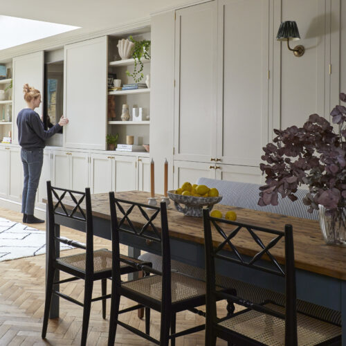
The works consisted of a full internal renovation with a small amount of reconfiguration, new flooring, decoration, bespoke joinery, soft furnishings along with furniture, lighting, and accessories.
“We always like to mix old and new and stay true to the heritage of the property”
Photography: Sarah Griggs
The Inspiration:
At Frank & Faber we start all our projects with a design questionnaire, we ask our clients lots of strange questions about where they like to go on holiday and their favourite restaurants. In this case the questionnaire proved particularly helpful because Nishita is a real foodie and she has become our first point of call for restaurant advice!
We always spend time getting to know our clients aspirations, needs as well as their fears so that we can design a scheme which is totally tailored to them and their tastes and make the process as smooth as possible.
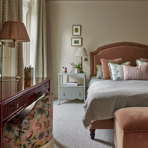
Whilst the house needed a full decorative overhaul our clients were very clear that they didn’t want the space to feel contrived or too try hard. They were drawn to Frank & Faber initially because we always like to mix old and new and stay true to the heritage of the property. Nishita, particularly, is a fashion lover as well as foodie and we drew a lot of inspiration from some of her favourite designers. The house needed to work well for entertaining family and friends, have wow factor while remaining practical for the family and their 2 young daughters.
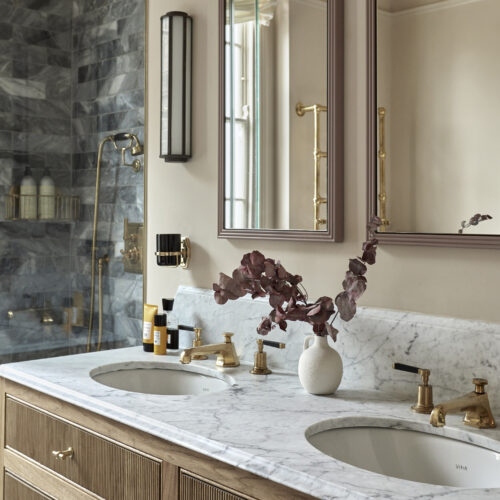
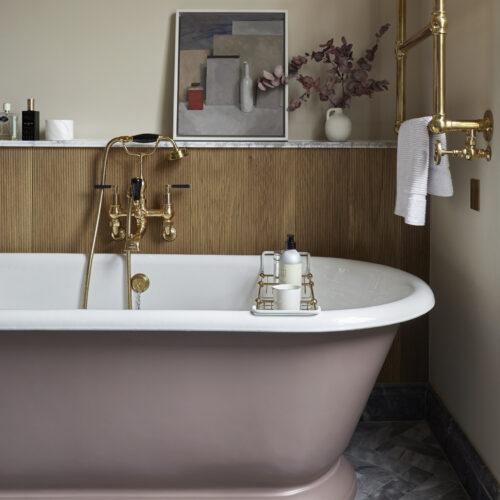
“We consistently used a warm colour palette and natural materials – marble tiles, timber and brass which will age with time”
Photography: Sarah Griggs
The Details:
As a listed property it is a requirement to retain the heritage of the property intact, which is always something we would aspire to in any case. The house was blessed with many period details which we retained and restored. However, in some cases, such as the lower ground floor, there had been modernisation which was less than sympathetic and left the space feeling cold and soul-less.
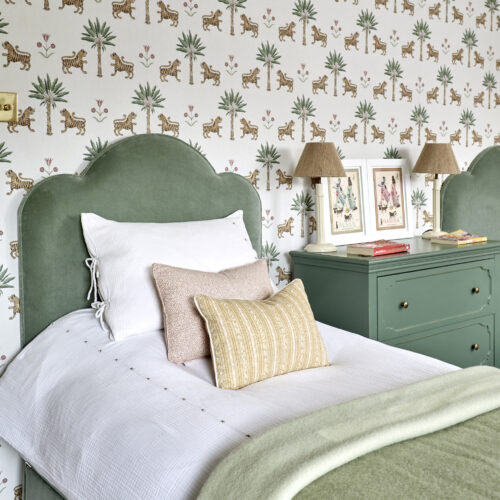
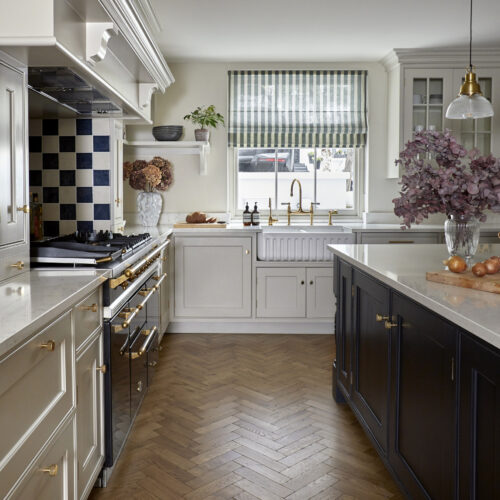
As the home of the kitchen/ dining and family living area it was important for this area to feel warm, comfortable, and stylish. With the transformative power of texture in mind we introduced a wooden herringbone floor and tongue and groove to the walls. The kitchen itself was kept simple and elegant – allowing the stunning oven to sand, framed by a chequerboard splash back and striped window blind.
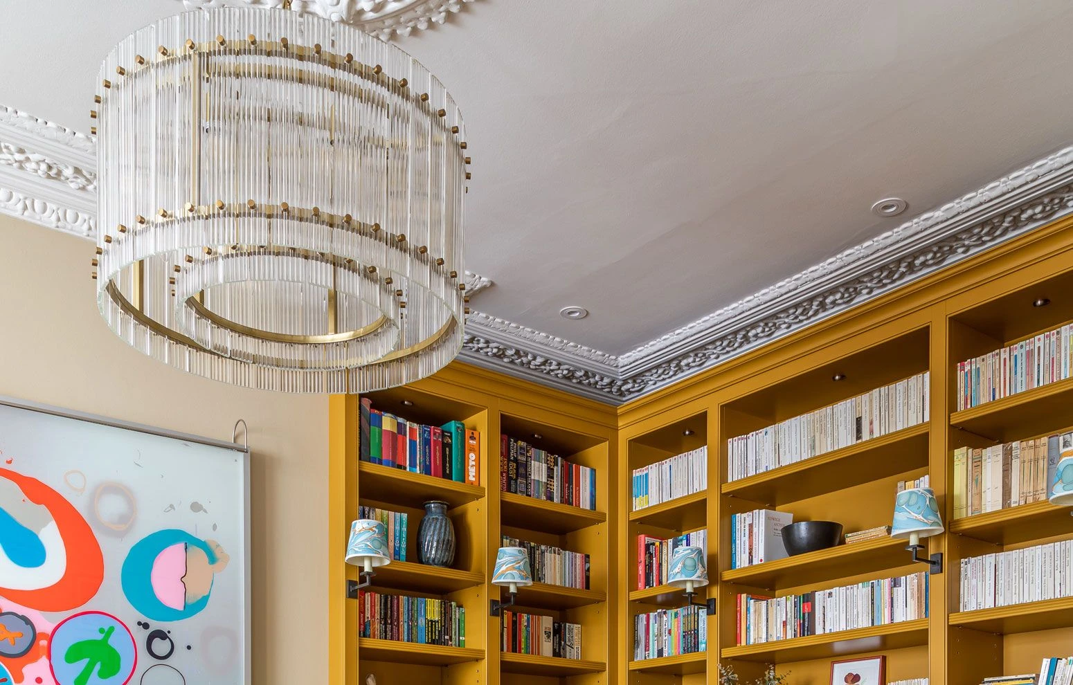
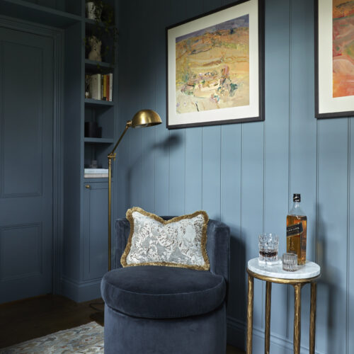
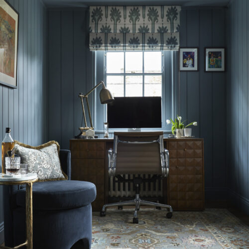
Another huge transformation is the first-floor study – originally a stark, soul-less box room (the room of doom). Now, one of our favourites with the introduction of textured walls, bespoke joinery and a gorgeous colour block in Farrow & Ball De Nimes.
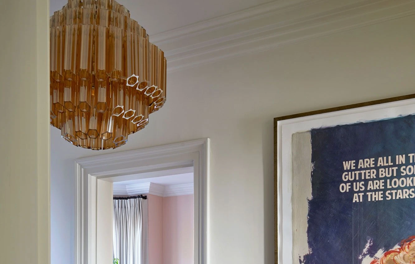
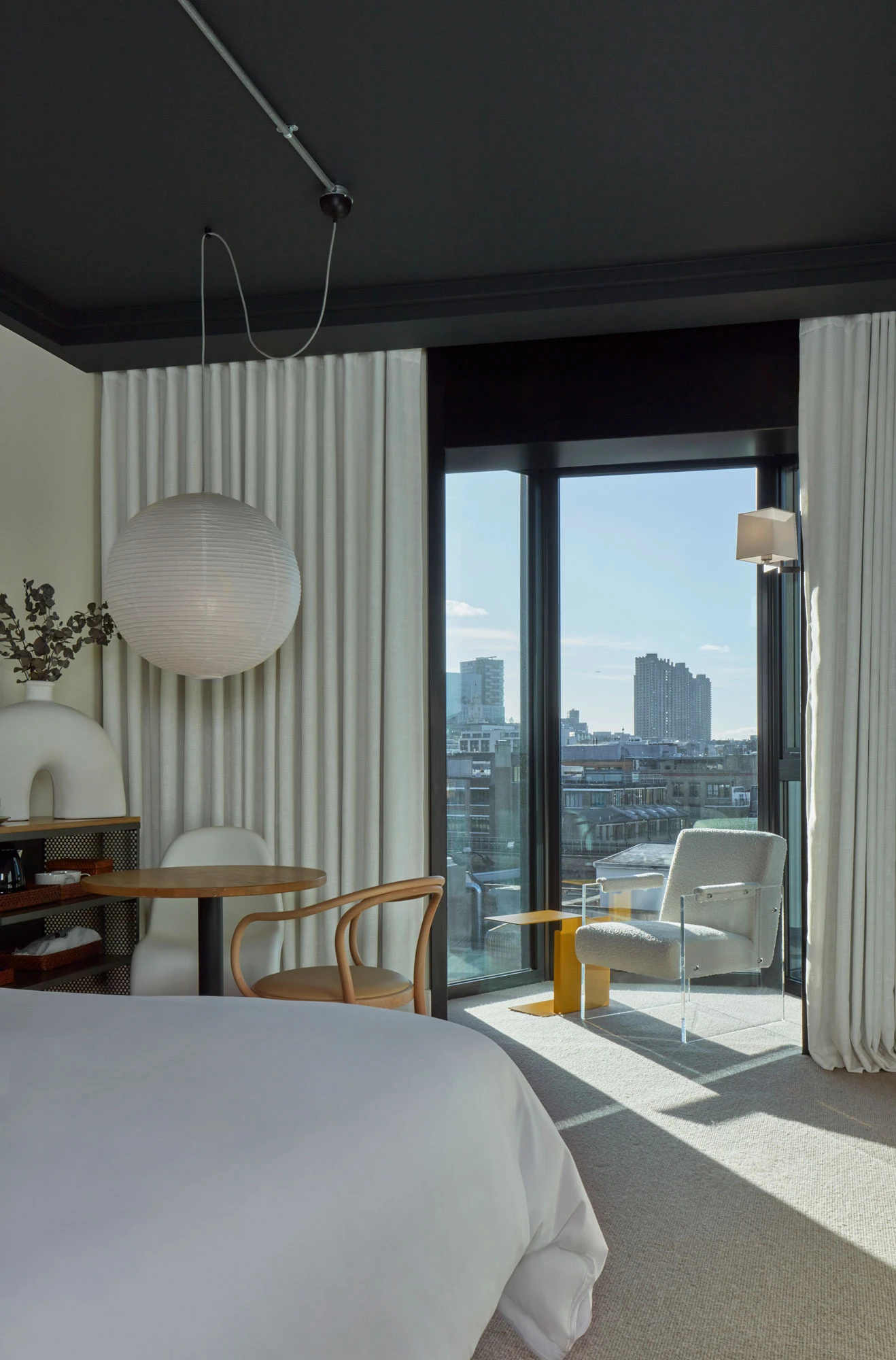
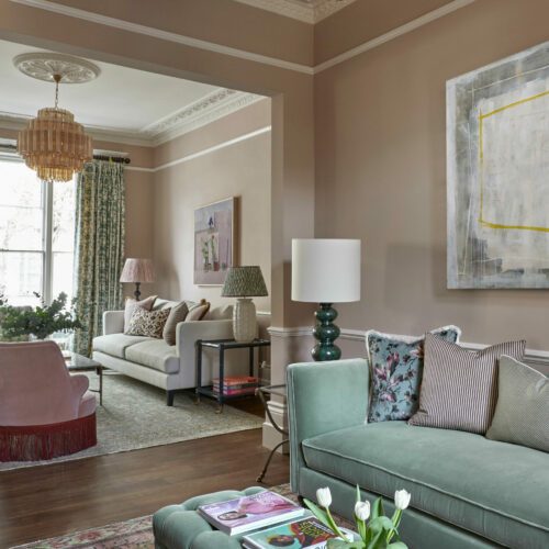
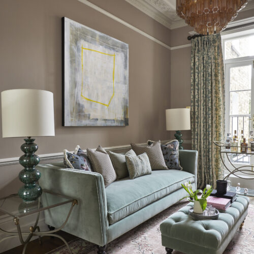
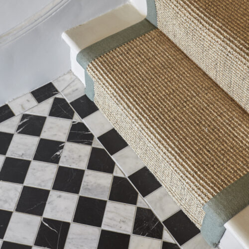
The entrance hall was given wow factor through the introduction of a stunning marble chequerboard tile and of course the fabulous globe lanterns from Pure White Lines. This carries through into the smart double reception room which it’s warm blush colour palette and stunning Palermo Chandeliers in amber which really frame the space.
We consistently used a warm colour palette and natural materials – marble tiles, timber and brass which will age with time. The overall scheme is elegant, comfortable, and striking. Totally practical for the family’s needs with real wow factor.
Photography: Sarah Griggs
To find out more about Frank & Faber visit their website here and follow them on Instagram.
Photography by Sarah Griggs: Website / Instagram


View the full range of these 70’s inspired chandeliers, available in Amber, Pink, Smoked Mirror or Clear glass.